Transformed Marauder Looks to Lead University of Mary into New Era of Athletics
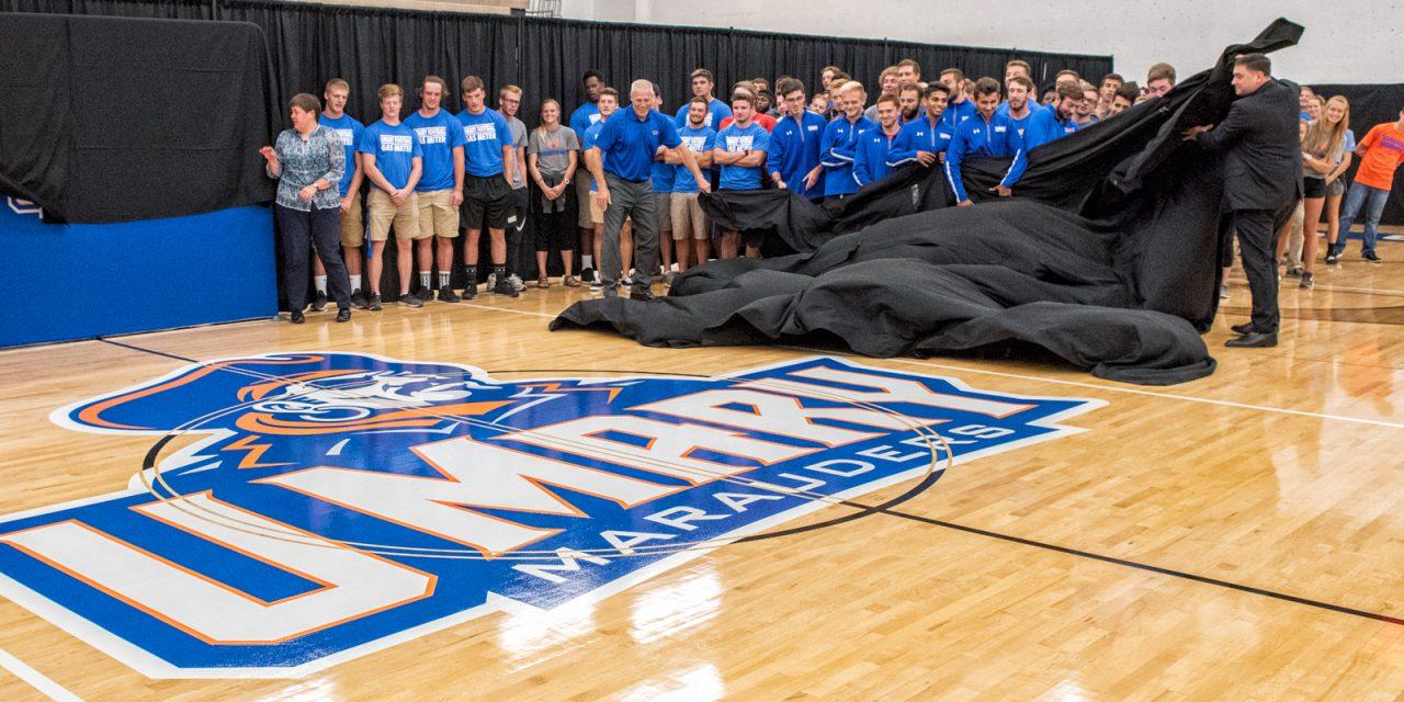
University of Mary unveils new Marauders logo and brand
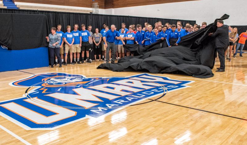
BISMARCK, ND — The University of Mary introduced its new family of athletic logos at a spirited rally today in front of cheering students, alumni, faculty, founding sisters, community supporters and media. University of Mary President Monsignor James Shea and Athletic Director Dale Lennon unveiled the new logo inside the McDowell Activity Center (MAC)—home of Marauders basketball, volleyball and wrestling—followed by a blessing from Annunciation Monastery Prioress Sister Nicole Kunze, and concluded with food, a photo opportunity and a chance to purchase brand-new Marauders apparel.
“We knew our legacy Marauders logo holds a strong place in all of our hearts and is loved by our fans, our alumni, and our founding Sisters of Annunciation Monastery. So our effort was to stay true to our past while creating a powerful new athletics brand for our future,” said University of Mary President Monsignor James Shea. “We have talked on and off about renewing the Marauders logo for some time, but this is the right time for the change. Enrollment is booming at Mary because students are finding what they seek in the classroom, in community with one another, and in the spirit of NCAA competition. Our growth has been staggering over the past 24 months, and it includes new leadership in athletics, new facilities, and—always and ever—new hope. It’s a great day to be a Marauder!”
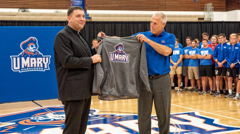
On behalf of coaches and student-athletes, the University of Mary Department of Athletics proudly presented President Monsignor James Shea, Mary’s number one fan, the first authentic and licensed hoody with the new Marauders logo.
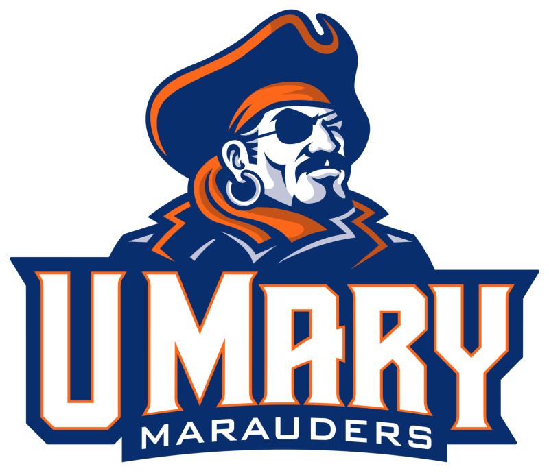
The new primary mark or main athletic logo is current, contemporary and three-dimensional, replacing the former athletic brand in use since 1990. And in this case, less has become more—gone is the color black with sharp lines on a left-facing pirate and replaced by a new right-facing Marauder clad in a new navy blue jacket and captain’s hat with a flowing orange bandana. Lighter shades and tints of these same colors were added to give the Marauder a dramatic 3D look. A white customized U-M-A-R-Y wordmark engraved inside a block of navy blue and outlined in orange with Marauders text embossed underneath is superimposed over the Marauder.
“I am excited to say with great pride, joy and a deep sense of gratitude, that University of Mary athletics has a new identity,” commented Lennon. “This new logo truly symbolizes a new era in Marauders athletics: we just launched a new successful Armada for supporters and fans to help us fully fund athletic scholarships; kicked off an exciting new Marauders Fest that engages the Bismarck-Mandan communities with seasonal,
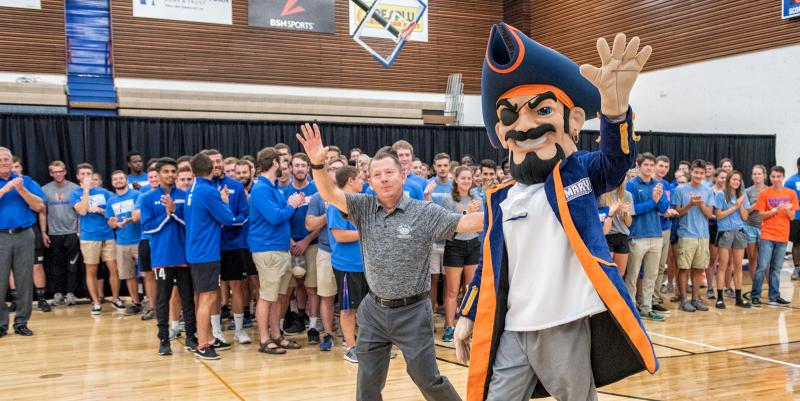
fun activities that raises money for scholarships; implemented a new streamlined online ticketing system so fans can conveniently purchase tickets and passes for games—again, with all revenue also going towards scholarships. The NCAA ruled in favor of our innovative Year-Round Campus program, allowing our athletes the option of completing their degree in 2.6 years or getting their master’s degree in four years without negatively impacting any athletic eligibility. Our coaches have our programs headed in an upward direction as we have teams and athletes competing for conference and national titles, and most importantly, our student-athletes are thriving in the classroom with a 3.22 grade point average (GPA). This new logo will serve as the foundation for all visual aspects of the athletic program. So, we want our fans to know, our alumni to know, our administration to know, our founders to know, that our athletes will wear this logo with great pride and dignity.”
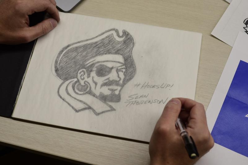
Somebody with just as much pride in the success and popularity of the new logo is its master creator, Bismarck’s own Sean Thorenson, a graphic design artist who’s an experienced logo maker and illustrator of more than 27 years.
“You can’t overestimate how people relate to a logo and the things they associate with it because they tend to transfer those emotions to the company or institution,” said Thorenson. “I am humbled, honored and excited. So I view this as a tremendous responsibility.”
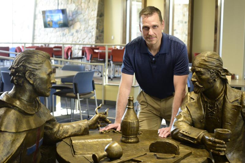
“Sean has a deep appreciation for our past, a creative eye for current trends, and a vision for the future of our athletics programs, and for all that we are grateful,” added Shea. “The University of Mary commissioned Sean not only for his exceptional skills but also for his willingness to work hand-in-glove with Mary’s own talented graphic artists. It was an impressive common project.”
Thorenson didn’t need to go far for his vision. In fact, his inspiration piece has been the talk of the University of Mary since its unannounced arrival nearly a year ago. And frankly, everyone who encounters it is intrigued by its slightly more than life-size stature occupying the center of one of the most popular places on campus—The Crow’s Nest Campus Restaurant. Students, faculty and guests who come every day in community to share a meal together have all wondered about the mystery and meaning of the Monk and the Marauder bronze sculpture.
“When I saw it, I understood immediately that the new Marauder was not going to be a sinister caricature of the stereotypical pirate,” added Thorenson. “Whether that sculpture represented a confession of the Marauders’ past or a renewed partnership for the future, I saw that he was going to be much different.”
The Monk and the Marauder sit across from one another at a table, a monk clenching unlocked shackles, the pirate holds a chalice of wine as they break bread together, sharing conversation. This powerful portrayal of the Christian themes of captivity and redemption also caught the attention and creative eye of Thorenson and quickly became the inspiration of the new Marauders logo.
“Since the sculpture shows the Marauder more dressed down—like a simple sailor (no captain’s hat) I kind of ran with this idea that this encounter with the monk had an impact on his life,” added Thorenson. “Regardless of his past, it changed the direction of where he was going, what he was doing. The Marauder in the new logo needed to have connection to the old, so the captain’s hat and eye patch were important to include. Fitting these details into the narrative: maybe our young sailor achieved the rank of captain and experienced some conflict along the way. Beyond that, I wanted this new Marauder to look confident, strong and certain, chin up with his gaze focused on the horizon. Standing proudly on the bridge of his ship moving towards his next goal. I wanted the Marauder to look like a confident and powerful leader, an individual with purpose and new vision—attributes I feel that Mary aims to instill in their students.”
And those same students, along with Mary’s alumni and fans, will also be excited about the old-school-looking letterman’s mark that is a throwback to the traditional collegiate logo style. This new Marauder-less logo has its new customized M-A-R-Y wordmark superimposed over an enlarged, orange U—outlined in white and navy blue. Certain to be a fan favorite, this letterman’s mark, along with the primary mark, is part of a family of new logos included in a professional style guide that illustrates the correct usage of all the new logo combinations for vendors and media to adhere to moving forward.
All apparel with the new Marauders logo styles can be purchased immediately on campus at the Robert & Marlys Fleck Bookstore in the new Lumen Vitae University Center (LVUC) on campus, online at www.bookstore.umary.eduand at the SCHEELS Store in the Kirkwood Mall.
